GREEN TOYS WEBSITE
The Green Toys Website was designed to be exciting and playful to reflect the fun that children have when playing with the company's toys. Green Toys stands apart from other toy companies because it creates environmentally friendly toys by using recycled plastic material in their product. The idea behind this website was to create a visual language that felt fun and imaginative which was achieved through whimsical type, an energetic color palette, and illustrative elements integrated into photography.
SKILLS: Responsive Website Design, Icon Design, Photo Editing, Illustration, Layout
PROGRAMS: Illustrator, Photoshop, XD
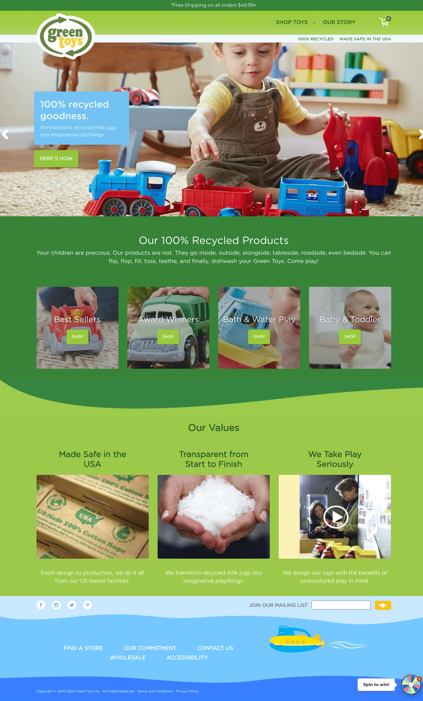
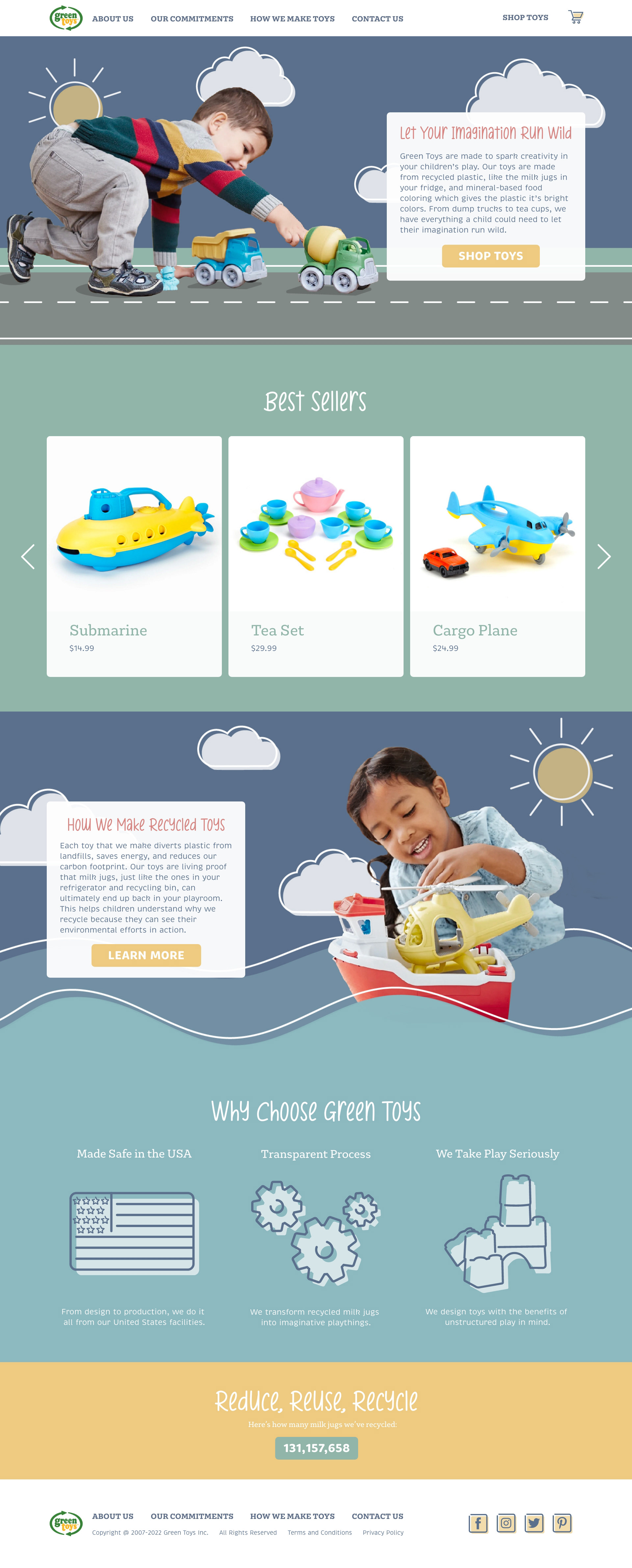
The Green Toys current website is a solid design; however, it did not feel fun or playful like a children's toy company should. For that reason, I chose to redesign their website to be more joyful and whimsical. I did this by creating a new energetic color palette and integrating illustrations with photos of their product.
In order to make the website feel more playful and whimsical, I integrated illustrations with photography. The photos were from the current Green Toys website; I brought them into Photoshop to mask out the background. Once that was done, I took the image of the children and the toys into Illustrator and created a new background with the shape and shape builder tools.
I created new icons with offset colors to match the illustrative assets that I used in the hero images. This particular icon, which was used for the "We Take Play Seriously" section, was created using a reference image of the Block Set from Green Toys.

